In 2007, at the famous, World Wide Developer conference event, Steve Jobs, the late CEO and co-founder of Apple, introduced the iPhone to the world. By the next year, Google released the Android OS to the world and made it free to OEMs worldwide. Both device and OS have gone on to change how we consume content, interact with one another and influence the way information is disseminated.
Today, It’s hard to imagine life without a smartphone and some of the apps that we use and depend on daily; WhatsApp, Gmail, Evernote(I use this daily), Pocket, etc. Some of these apps have become ingrained in our daily lives, so much so that hardly a day goes by without us using them. Some serve as productivity boosters and others for leisure and entertainment.
Often times, product designers and app developers unconsciously(I’d hope so), neglect a particular demography, this demography, though small, may not necessarily be inconsequential. I’m referring to those who are semi-literate and those in the age bracket of 70 and above.
Early this week I started thinking about this particular demographic. One question kept ringing in my mind; do designers and developers outrightly neglect these people or never considered them during their design and brainstorming session? Is this demographic so small that they don’t matter? Why aren’t there two versions of some applications, one for the savvy, literate and digital natives while the other cater to those who can’t read or are digital immigrants.
Last year, in the wake of the Ebola outbreak, while a good number of the West African countries were hit really hard some well-meaning people took it upon themselves to educate the public on how to take care of themselves, symptoms to watch out for and general preventive measures. This year, the Lassa Fever epidemic is on the rise and seems to be rising pretty fast. How do we spread information about these issues in a very efficient and effective way? One that will have considerable impact and save thousands, if not millions of lives and people from heartaches — Mobile Apps, this is the surefire way to get this out.
Mobile apps have become ubiquitous. With the proliferation of sub $100 Android devices, it is quite easy to pass on information very quickly and effectively. Often times, you will hear people joke, saying something along this line — There’s an app for that. Now how can we design these apps, so that my 80-year-old grand mum who had almost no formal education can take advantage of this and benefit from this new information revolution?
Typically, mobile apps make use of a combination of icons and text to pass information and convey a message. My grand mum can’t read, so she’s essentially not going to use this. How about we flip the coin on its head and design the apps instead with traditional icons, one with cultural meaning and context, not the standard icons every stock app ships with today. Instead of text, why not we substitute it with videos, audios and pictures? Will this help grandma? I think it will.

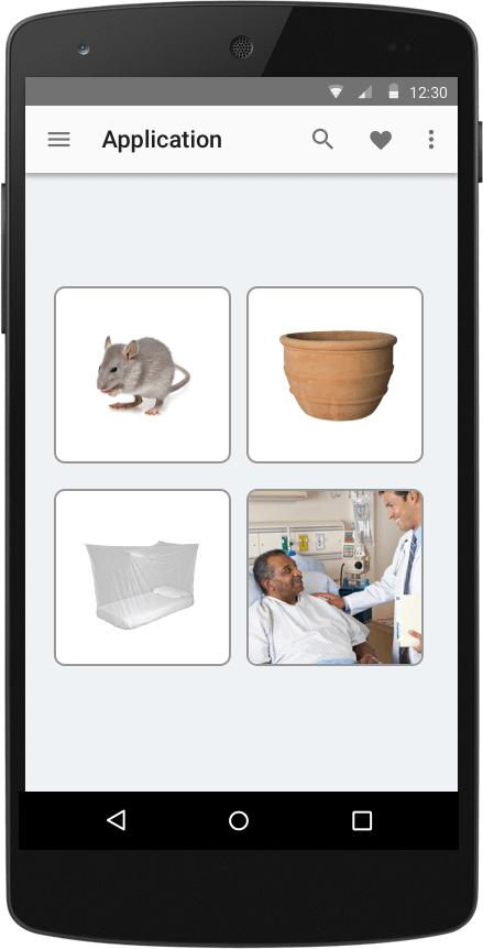
Concept design for medical app
My gut feeling tells me she will make more sense out of this. This will speak to her in a way she understands.

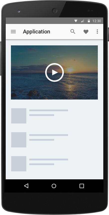
Video playing
Let’s imagine an app, one where the home screen shows a picture of a rodent, mosquito, mosquito net and a sick person. When she taps on the picture of the rodent, a video of how a rodent is eating food meant for humans plays and this video goes on to explain how if a human eats this same food may likely end up sick and possibly die. On tapping the picture of the mosquito, a video of how mosquito transmits malaria is shown. Other pictures, when tap, can display slideshows and these slide shows will possibly show preventive measures and simple personal hygiene method. I’d imagine this passing the message and making more sense to her and people like her than an app full of text and hard-to-pronounce medical terminologies.
Granted, it is hard to simplify or create every app this way. It isn’t a mean feat by any means. I think the vast majority of the app that can benefit from this sort of design will be mostly informational apps. Medical, health, fitness and recipe apps can possibly adopt this design principle and finally cater to this long tail. This unserved market. Please don’t ignore my grand mum.
I'll love to hear from you
Do you want to say hello? Email me - celestineomin@gmail.com
I tweet at @cyberomin
If you enjoyed this post, please consider sharing it. comments powered by Disqus